Tuesday, June 17, 2008

HDR - for real this time

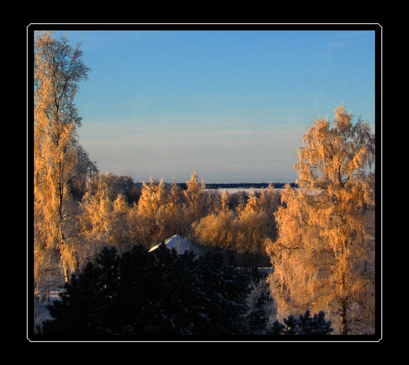
I just started a new era in my graphics/photomanipulation career. Yesterday I purchased the Nikon D80. What a magnificent piece of electronics! Above is the result of me testing the bracketing-funktion. I used Photomatix Pro to create the HDR, and I then gave the render the finishing touches in Photoshop. Below are the three exposures I used to create the HDR. As you can see I used the clonestamp on a couple of details. After getting the render from Photomatix PRO, I tweaked the colours in Photoshop using levels and hue/saturation. No colours added :)


A friend of mine is sworne by the principle that "what you shoot, is what you get". I´m not there yet, Photoshop is a much too integrated piece of my workflow. During my day out with the camera experimenting and shooting, I repeatedly caught myself thinking: I´ll fix that later in Photoshop.

Thursday, December 13, 2007

Friday, November 16, 2007

Egographia


Felt a bit artistic. Enjoy.

Sunday, August 26, 2007

HDR (or atleast a good fake)

I´m amazed. Really! I was browsing on Fotosidan and found this tutorial on creating "fake" HDR´s in Photoshop. The tutorial is created by Magnus Rydström, a guy whose blog I read on a daily basis.

This is the image I started with...


... and this is what I ended up with


This is so COOL! I´ve been admiring the images on Ben Willmores blog, and envying his technique. I stay humble and own great respect for mr Willmore - but I´m pretty darn happy with this result :)

Thanks Magnus. This is super.

Tuesday, July 24, 2007

Operation: Free Koodi

From this

To this


This is a pic by a friend of mine. Her late rabbit, Koodi, is inside the cage. My mission was to remove some disturbing elements such as the cage and the couch. The techniques used are pretty much the same as in "Removing reflection" but for this piece I had to use different techniques to create a lighting so that everything would look realistic. I was also forced to use another image to get the face of the rabbit to look real.

Monday, May 07, 2007

Removing reflections


Above is the original picture of the ATR 42-500, a FinnComm airliner on the runway in Kuopio, Finland. The sunrise is beautiful and the mood is magical with the plane in the mist. Unfortunately the photographer (a friend of mine) is visible as a reflection in the window. So, I was asked to do something about it. I must say the project was challenging. You can see the result below.


How I did it? Well, that´s a long story. For this project, the healingpatch sure came in handy.
-I created a new layer, chose a good color with the colorpicker and painted in the reflections. I was careful not to paint too large areas at once. I then control-clicked the layer, making a selection, merged the two layers by pressing ctrl-e, and changed the tool to the healingpatch by pressing the j-key. I dragged the selection to an area where the structure was similar to the area I was recreating.

The sky was hard to fix. So I ended up making a selection with the magic wand and creating a gradient where I picked the foreground-color with the colorpicker from the darkest part of the sky and the background-color from the light part of the sky. Some serious masking let the sun through while hiding some nasty reflections.

The clonestamp was used on some parts of the fuselage, I used low opacitysettings to avoid sharp edges.

A part of the runway was recreated by painting in the area with a good, dark color, adding noise and changing the opacity to about 30%.

Wednesday, January 03, 2007

All I want for Christmas is... Photoshop


Here´s what I gave my mom this Christmas. A coffemug with her two newly-adopted cats. Pictures 1 and 2 were taken with the 3 megapixel camera in my Nokia N80. The camera in the phone is a nice toy but that´s all. The quality is crappy and I almost busted my ass off trying to get the cats to look somewhat normal in the pic (number 3) I sent to be burned on the mug (which is also photographed with the Nokia). I also had to recreate a piece of the ear of the B&W cat.

The mug came out pretty good, though. And my mom was happy, and that is ofcourse the most important thing.

Sunday, November 19, 2006

Juniperus communis

Inspired by mr Karlsson to try a new filter in Photoshop if a severe lack of inspiration suddenly hits. A copied layer of the pic treated with a dose of the chalk-&-charcole-filter, with the opacity set to about 70% to let the colours through. I find the result pretty good, concidering the minimal amount of work put into it.

Tuesday, November 14, 2006

Memories

Perhaps you recognize the chair in this image. That's because I posted an image a couple of months ago from the same scene.

The techniques used are very similar to the ones used in my earlier post "silence". I combined some old text that I scanned, a picture and a few techniques where the image is made looking old. This time I got a bit more philosophical in my photoshoping, though. I wanted to present an image where the object (in this case, a chair) is given life. Does this sound corny? Well, perhaps...

This is, however, what I was processing in my mind as I created this collage.
The chair, all destroyed and worn out, has served its purposes. People have been reading, thinking, laughing, arguing and perhaps creating life in it. Is what we see with our eyes all what is left? Or does the object remember? If it does, then what could it tell us?

How about you? Does the pic make you think about this, at all? Please, let me know.

Friday, September 29, 2006

ExLibris 2

Another ex libris created. Guess whose it is :)

Thursday, September 28, 2006

Logos

So, here are the two logos I created for my buddy CP-Geek.

Wednesday, September 27, 2006

ExLibris


Summer´s gone, autumn is finally here again. This of course means a lot more time spent playing with my Photoshop.
Lately I´ve been working on the layout to a business card for a company and a couple of logos for a website.

Above is an ExLibris that I created for myself (for you who don´t speak latin, I can tell that nomen nescio means "the name is unknown", the prints I have naturally have my name there)

The words in latin are: perspicientia, commendo, disciplinae, decus and honestus
These words mean: knowledge, commitment (to care or protection), discipline, pride and respect. Words that can be described as my motto.
On the shield there are two swords, the symbol for medicine and the lion.

Saturday, June 10, 2006

Silence


From an abandoned cottage in the woods.
Once popular to local kids, the place was called "the 34" (perhaps inspired by a song called "this ole house"of a Swedish orchestra back in the days). The cottage saw many generations come and go. Moments of joy and anger. Laughter and heavy drinking. Love making and fist fighting. All that is over now, what is left is an empty building with destroyed furniture.
An era has ended, now there is silence.

What I have done to the image (in Photoshop 7):
-I made it B&W using the Channel mixer
-I copied the layer and added diffuse glow to the new layer, I then adjusted the opacity (once again, thanx to Mattias for that tip)
-I added grain and darkened the back of the chair
-I created a vignetting by making an oval selection, changing the feather to about 80 and darkening the selection with hue/saturation.
-The frame was created by adding a stroke to the pic, enlarging the canvas and adding some old text that I scanned from a 100 year old book to the black frame

Sunday, June 04, 2006

mr Charisma

For a couple of years ago I visited Buffalo, NY. One day I was walking through an area with some old houses, and I got to meet mr Charisma. I don´t know his real name but when going through my photoalbums I always refer to him as "mr Charisma". He was a nice man, with a nice dog. I hope he is still fine.

Friday, June 02, 2006

Reptilia

Got a little crazy today and created this monstrum. Don´t ask me why. Perhaps I was inspired by Lordi...

Wednesday, April 26, 2006

Waking up the Sleeping Buddha


In our bedroom we have a small statue called "the Sleeping Buddha". When there comes a time when you have too much time on your hands, and far too little to do, the result can be as shown above. The original pic is the smaller one on the left, and the finished result is on the right.

I photographed the statue with some roses in front of it. I then looked for some pictures of my fiancée in my archives and started my project.
This is what I did (briefly) using Photoshop 7:
- I copied the face of my fiancée to the image of the Buddha. Using Free transform, I made it the right size and rotated it correctly.
-I desaturated the image.
-I then created a new layer, which I placed at the top. The layer was created by copying the background layer and then making the eyes, nose and mouth of the statue dissapear using the clone-stamp. I used the patch-tool to make the new "non existing" face look smooth, without loosing the golden texture.
-I used layer masks on both the human face and the new "non existing" face to get them to fit perfectly onto the statue.
-I set the blend-mode of the top layer to "overlay".
-Using different layers and layermasks the face took shape. To get the face to appear more clearly I enhanced the shadows and the highlights in the picture. I found it important to use different settings of the paintbrush opacity (preferrably low values).

Creating this image took about five hours of work (breaks included).

Please tell me what you think about the result :)

Sunday, April 23, 2006

Panorama

I had a go at creating panoramas today. Here´s the result.
It consists of totally 5 images, from which I cropped the above.

In creating the panorama itself, I took the easy way and used PhotoStich (Canon Utilities PhotoStitch Version 3.1). Yes, it´s cheating. But:

I then fine-tuned the image in Photoshop 7 using
-the patch-tool,
-the clone-stamp and
-adjusting curves in LAB-mode.

I also sharpened the image in LAB-mode (sharpening the lightness-channel with unsharp mask). This I learned from the cool guys at PhotoshopTV

Wednesday, March 01, 2006

Winterlandscape

Here is a view from our kitchenwindow one beautiful morning.

And, yes, the image has been modified (slightly)

-I copied the layers (twice) and set the blend mode to multiply, I used layermasks with gradients on the darkest parts so they wouldn´t be completely black.
-I used levels to get the most out of the colours in the image.
-There was also a lamppost in the middle of the picture, but I removed it using the clone-stamp. The glass in the window was also a bit dirty and caused dark spots all over the image, but using the healing-patch solved that problem (no more washing windows for me :))
-Finally I used the sponge-tool over the trees to get a warmer feel to them.